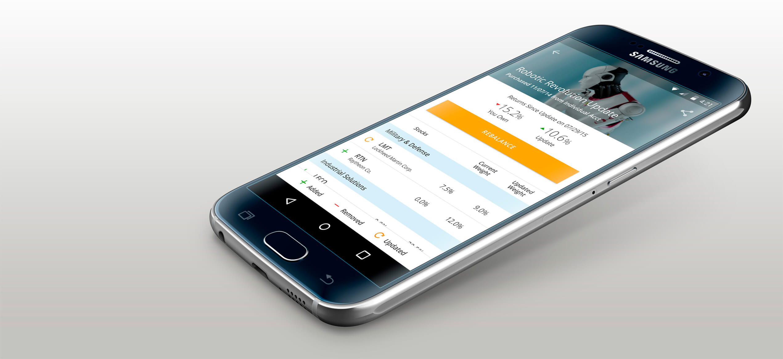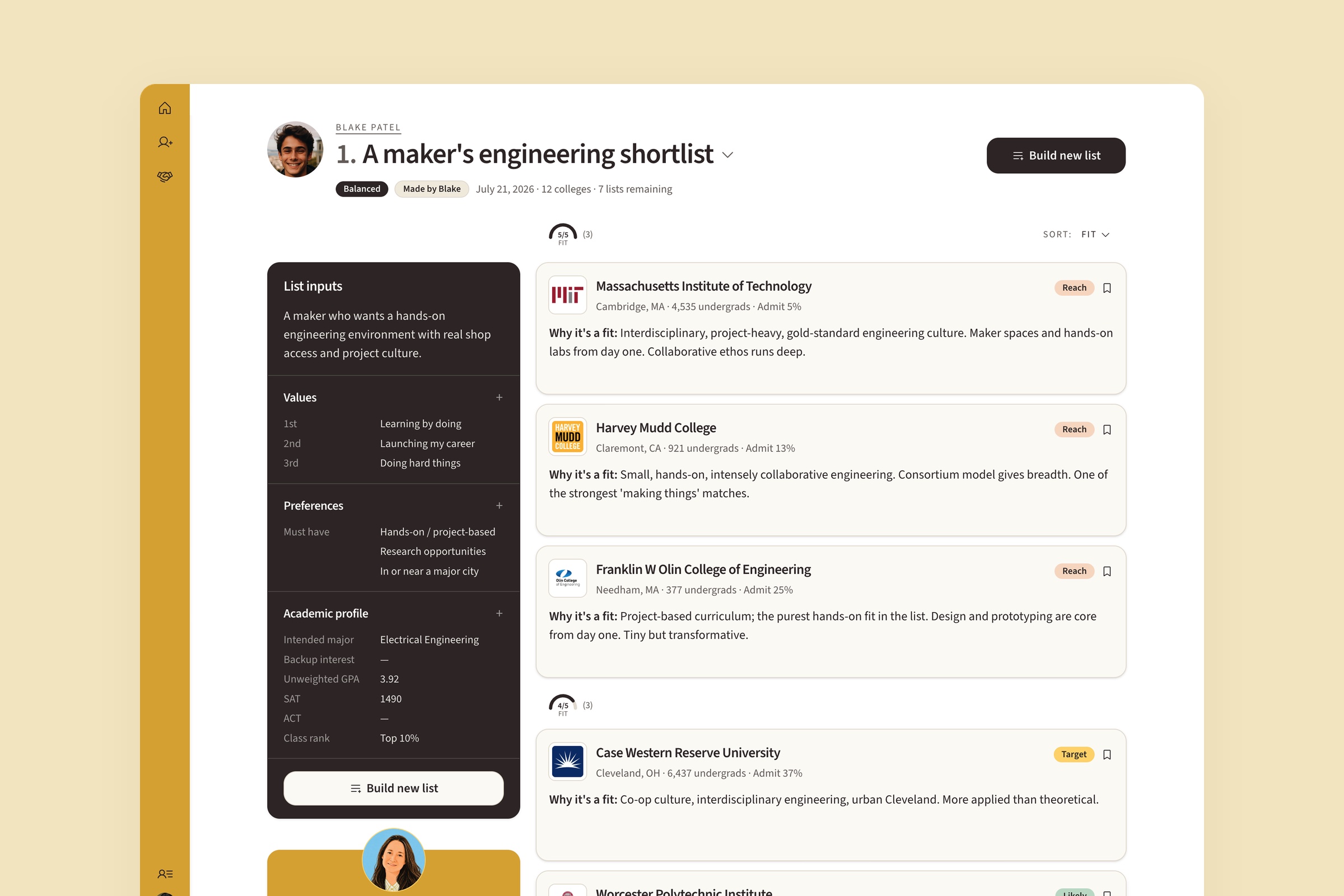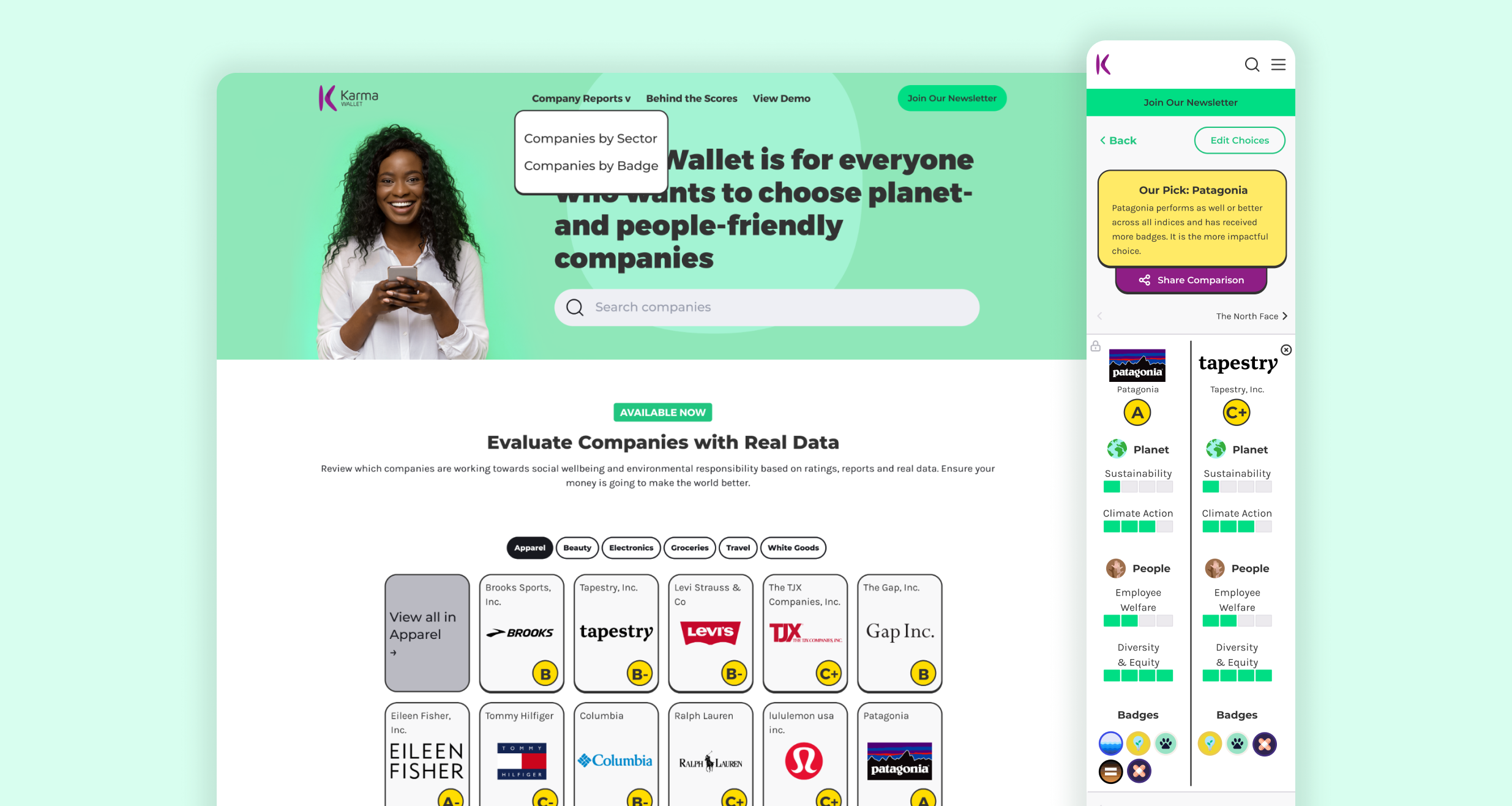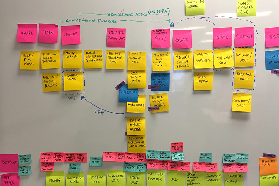
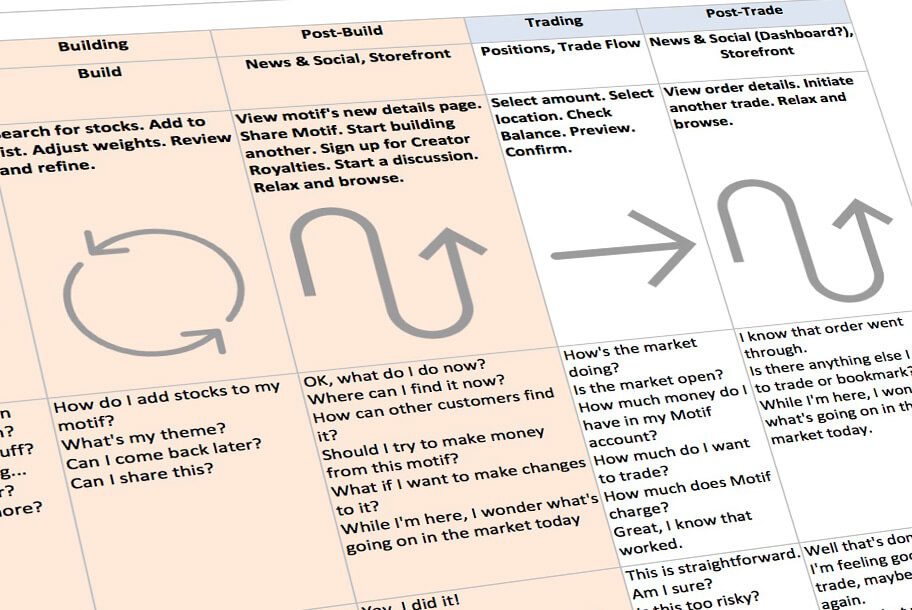
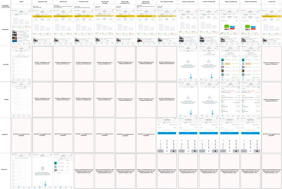
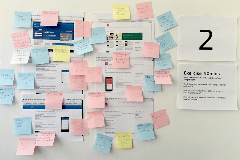
Customers could be at very different points: applying, funding an account, or managing past, active, and pending trades. Support for those states was uneven, so I mapped out the flows and redesigned the screens to make the next step clearer for each user.
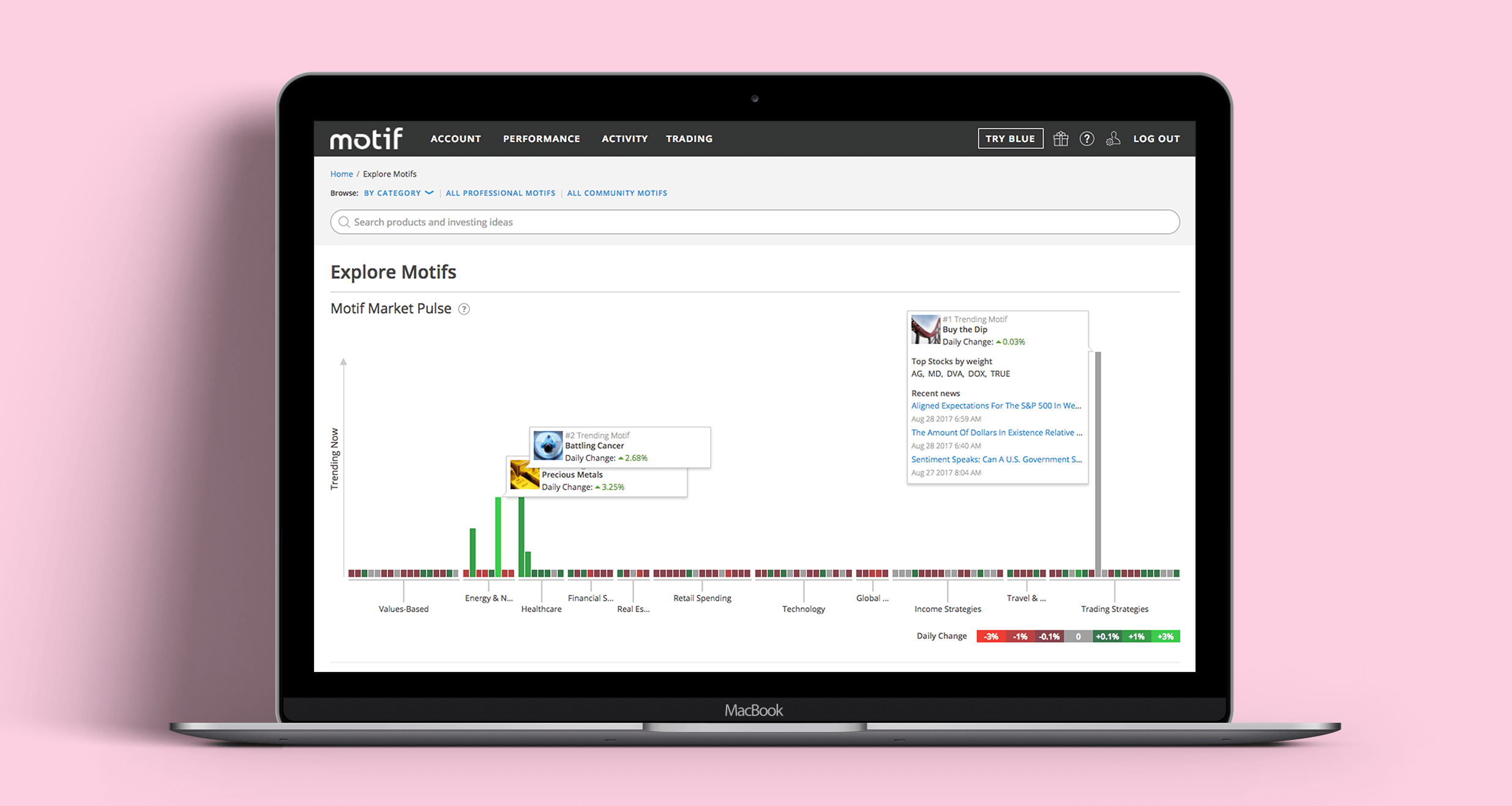
Across those states, research revealed something I initially resisted: investors wanted dense displays of quantitative information. They needed to compare several things at a glance, and repeated testing made it clear that stripping the screens down too far wasn't helping.
I looked to Excel for inspiration. We developed a mobile pattern that kept one column fixed while allowing the rest of a data table to scroll. It gave users the density they wanted within the constraints of a narrow screen—and became a useful pattern throughout the redesign.
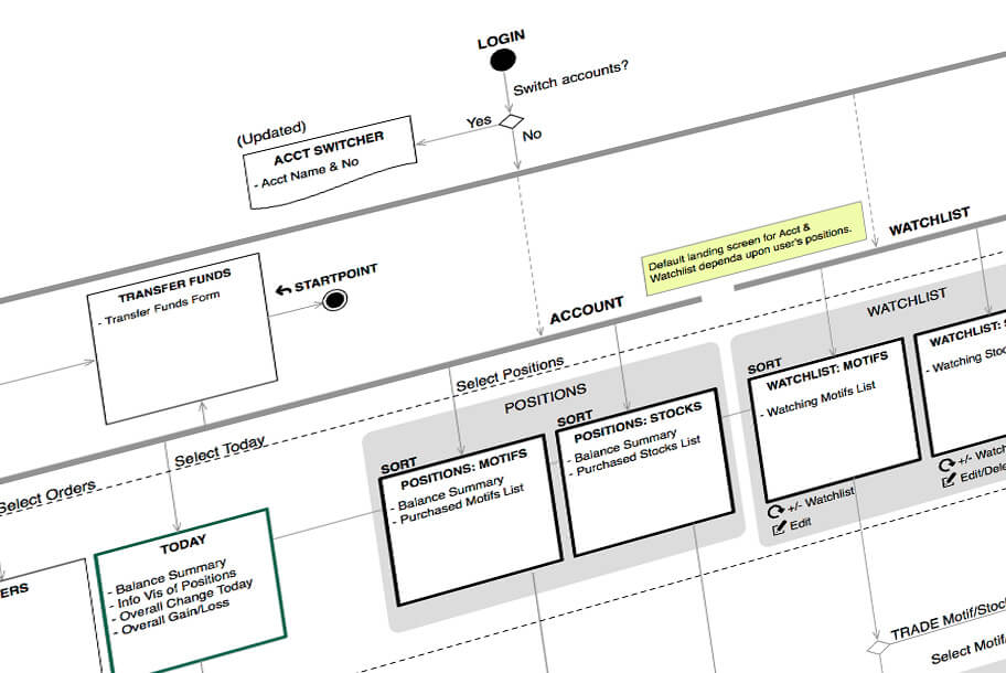
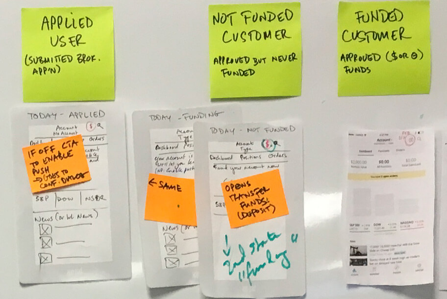
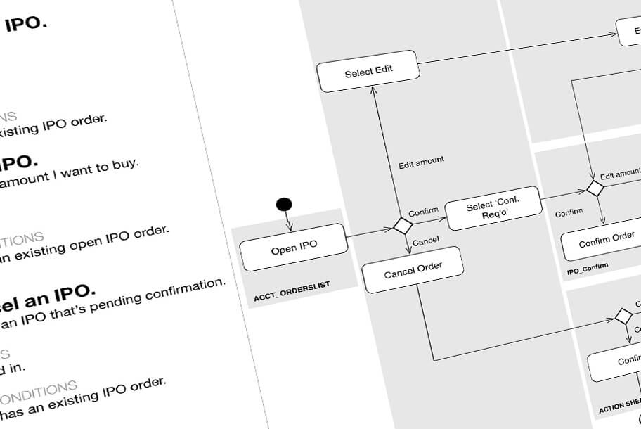
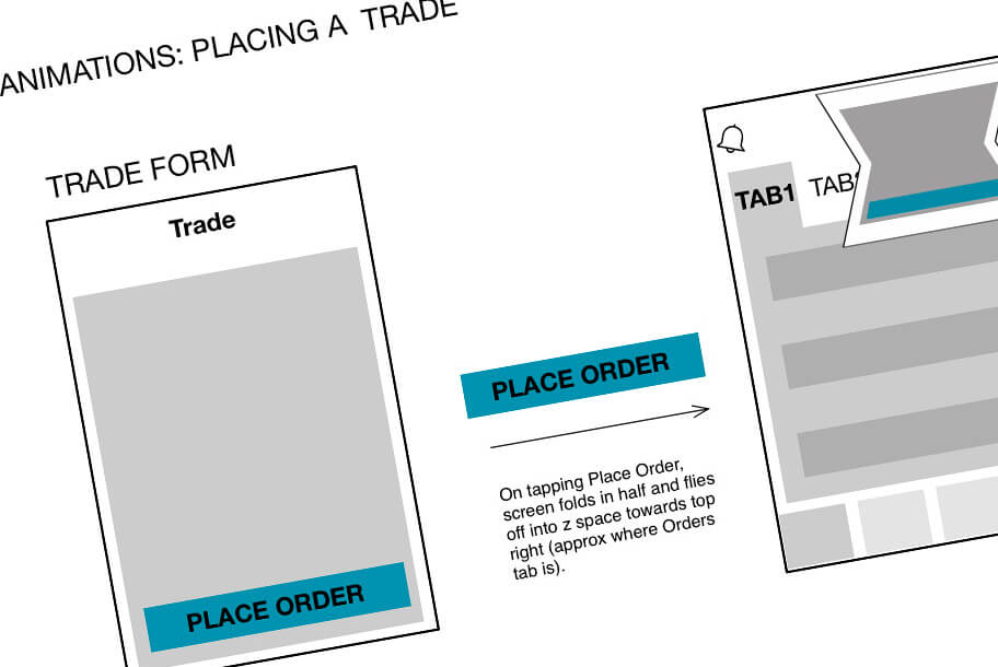
Making time early for exploration, prototyping, and user validation paid off. We could resolve the larger structural and interaction questions before working through every screen state.
Just as importantly, testing challenged my own assumptions about what a good mobile experience should look like. The best solution wasn't the sparsest one; it was the one that helped these particular users think and act.