


Visualizing Stock Volatility
Role
UX Lead
Design Research
Platform
Web (Responsive)
Scope
New Feature
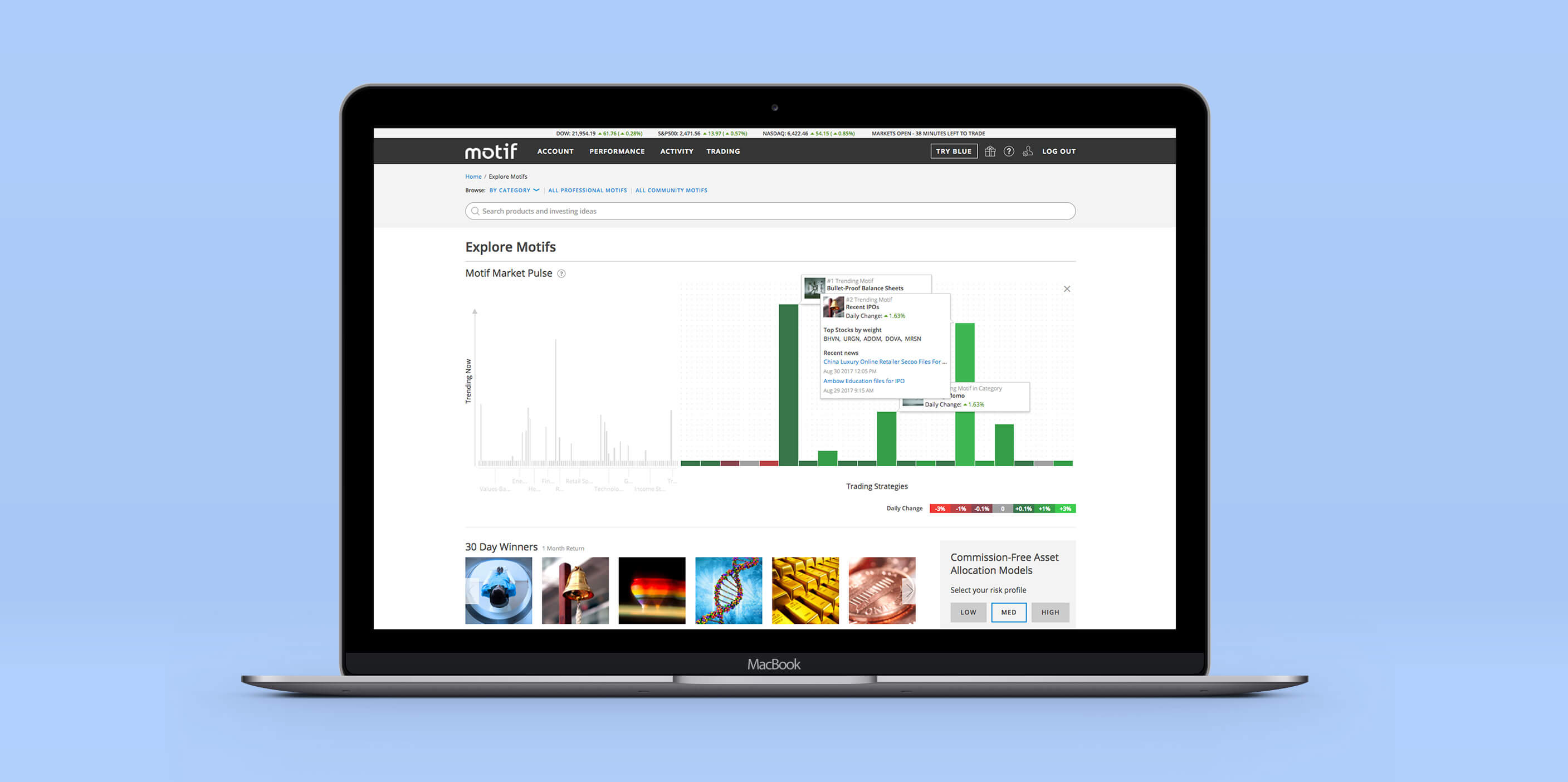
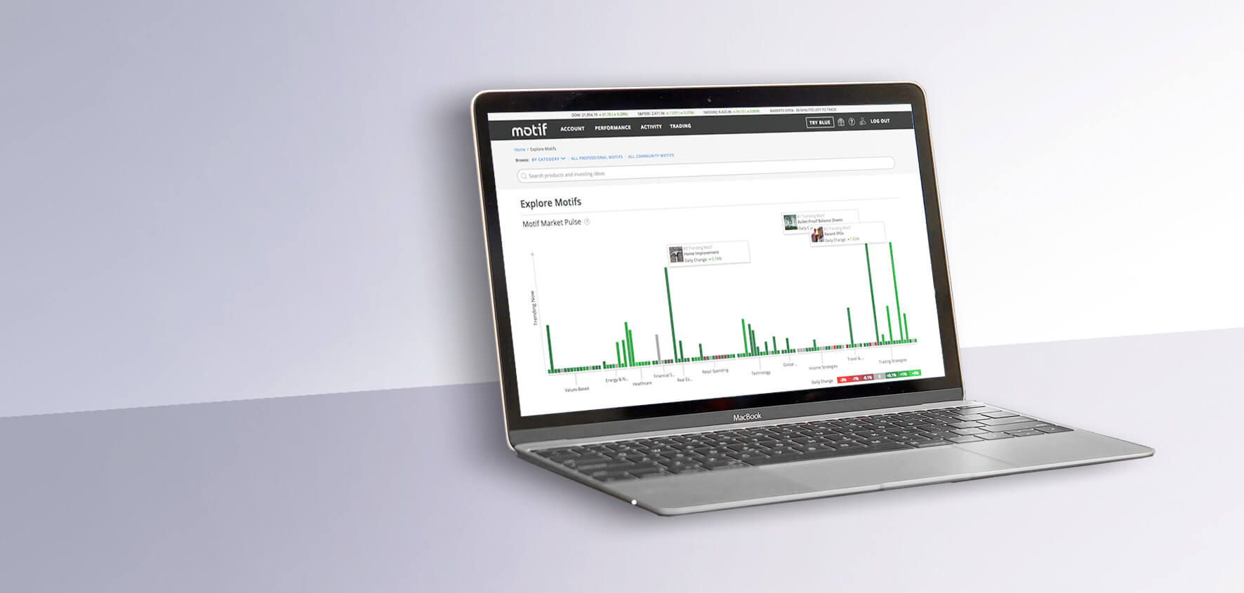
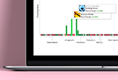
The company has struggled to explain their offering–motifs, or bundles of thematically similar stocks that can be traded as a group. The goal behind this data visualization was to clarify this idea of a motif and their connection to world events.
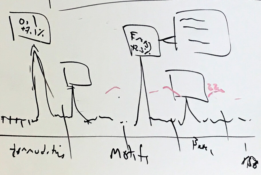
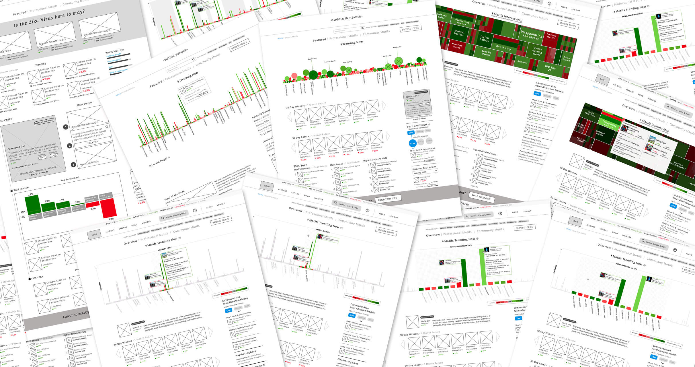
Rapid Experimentation
This project had a very loose brief and so I generated a lot of different designs, at a fairly low fidelity and used these to shape the conversation and to clarify the intent behind the brief. These mockups were key to nailing down what we wanted to achieve in terms of user comprehension and engagement.
Data visualizations often confuse, even the simplest ones, and so it was also critical to get a lot of these designs in front of users early on to start to understand what worked and what didn't.
Key Takeaways
When you're designing data visualizations, two things are true. The first is that you need to put them in front of users. When you do, you'll learn very quickly that data visualizations take a while to parse and many people aren't willing to put in the effort. Simplifying and relying on standard conventions can help. The second is that you need to design for real data. Early on in the project I didn't have access to real numbers and ended up discarding some designs that just weren't interesting once real data was applied to them.