Investing Made Mobile
Role
UX Lead
Design Strategy
Design Research
Platform
iOS
Android
Scope
Redesign
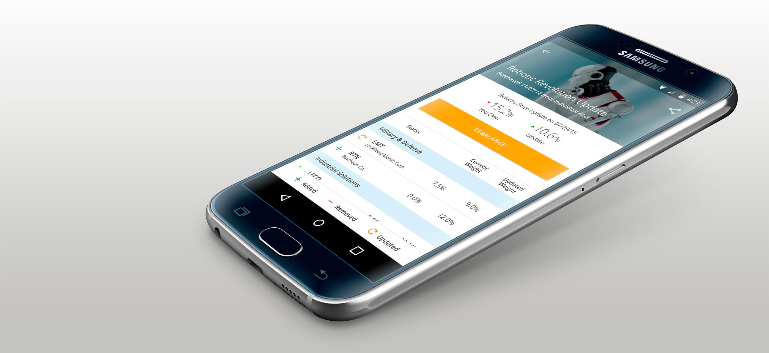
Motif is an online investment platform offering thematic investing. I led the UX redesign of their iOS and Android apps. The challenges were less in defining the product, which was fairly mature, and more in creating a great user experience.
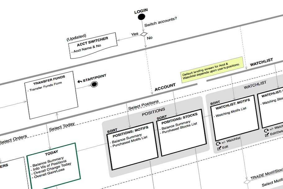
Motif's offering is broad and targets fairly financially savvy users. As a result, we needed to successfully present dense, quantitative information throughout the app, with limited screen real estate. Add to that, the need to design screen variants for many different user states (funded? trade pending?), and you have an interesting visual and interaction design challenge coupled with the challenge of understanding and redesigning undocumented user flows from the ground up.
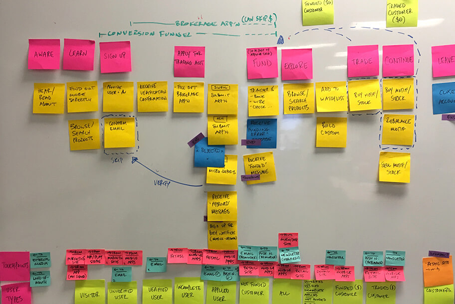

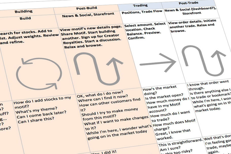


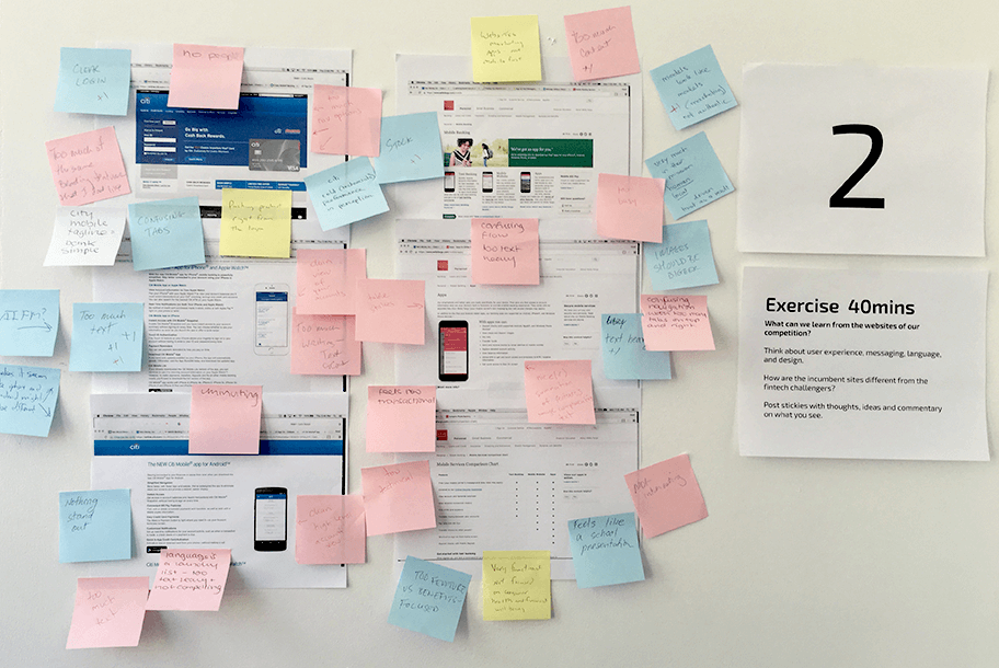

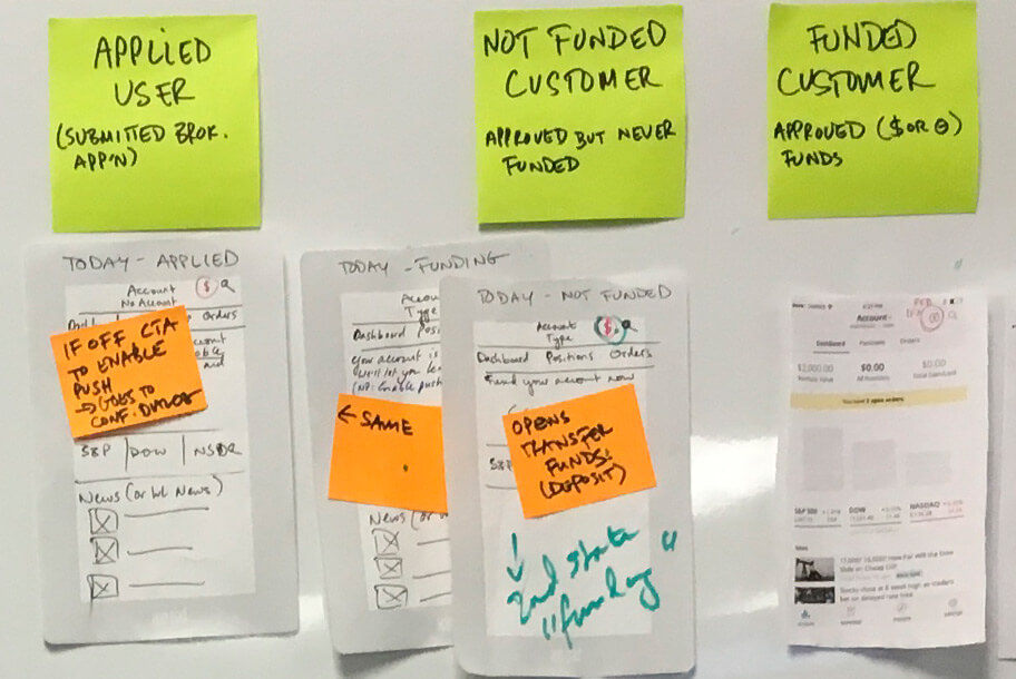
The whiteboard is your friend
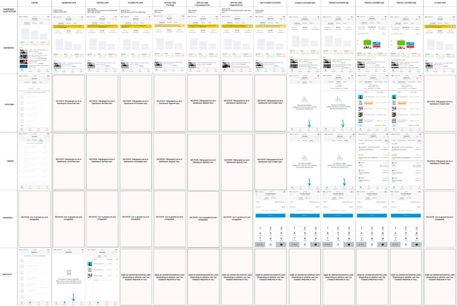
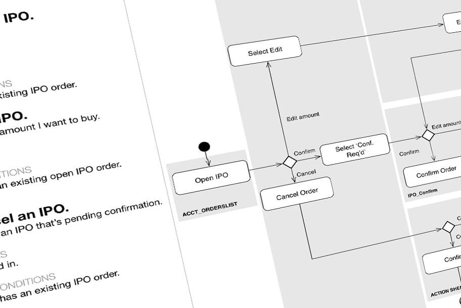
Our users range from new customers with pending applications, unfunded customers, customers with past trades, active trades, pending trades..., and the list goes on. Support for all these different user states was uneven. I spent a lot of time mapping out the users, redefining their permissions, and redesigning screens and flows to support them and offer an easy onramp to the next user state.
All our users, regardless of state, are hands-on and want to scan dense displays of quantitative information. It went against the designer in me, at first, but again and again in testing sessions, it became clear that they wanted density because that supported their need to compare and evaluate multiple pieces of information at a glance. After experimenting with many different but imperfect design solutions I started to focus on Excel, which, after all, does what it sets out to do well. We created a solution that, like Excel, enables users to view rows of data with a column frozen but we did this with considerably more style, I hope! This solution was key to the redesign, since many screens are essentially versions of this view and works elegantly in mobile, with its limited and vertical screen real estate.




Key Takeaways
Timelines and design process worked beautifully in this project. I carved out ample time upfront to ideate, prototype, and validate solutions. I was able to nail down the overall structure and "point of view" before a lot of the more granular work took place. Having room to prototype, validate and work closely with Engineering in an exploratory phase were key to developing solutions that solved our problems in ways that worked for our users.
Once we had answered big questions and entered the more concrete phase involving flows, wireframes, and high-fi prototypes, I was able to stay one step ahead of visual design so that we could have constructive dialog within the design team, reflect that in our work, and have everything baked before development started and change became more difficult.
Great app
I enjoy using this app, I started using motif last year as a secondary investing account and this app makes keeping up with my stocks very intuitive and easy to navigate. I'm instantly able to see the day's gain or loss and with one click can see the total percentage growth. I recommend it!
Jason Rafferty in the App Store (June 17, 2017)
